Sunday, November 17, 2013

Book Review : Asterix and the Picts

Asterix and the Picts : by Jean-Yves Ferri (Author) and Didier Conrad (Illustrator)


Its been a while since we got a well rounded adventure from the Asterix canon. With that master tale spinner Goscinny not around, Uderzo did a fabulous job at the art but not at the script. With that becoming the trend, this legendary world appeared to be doomed to be frozen.

Jean-Yves Ferri, the new story teller, has resurrected this celebrated village in style. It has all the magic of the olden times, the action, adventure, and at times predictable lines, yet with enough happening. The story is also refreshing and reminds of several past adventures. there is a lot happening, and is busy just as the Gaulish village is known to be. Its comical, funny and very colorful.

Didier Conrad, who has taken the mantle from Albert Uderzo, has brought the story to life faithfully in the Marcinelle style, that Uderzo popularized. and his style fits right in with so many things in each frame that came to define this adventure series.

I enjoyed reading an Asterix after a long time, and certainly recommend this for the fans of Asterix, and also to a new generation who can get started on this and go back to the original series.

This is an extract from my review at Amazon.com, You can find more of my reviews here. 


Tuesday, January 8, 2013

Book Review : Treasures of South India - தென்னாட்டு செல்வங்கள்


Art of India, particularly the ancient South Indian Art, is synonymous with sculpture. Gods, Goddesses, Temples, Dancers, Door guardians, Commoners, Horses, Elephants and several mythical Animals, and others talk to us directly in the beautiful medium of Stone as well as metal. 


Hundreds of years have passed, in fact more than a thousand years have passed, since these wonders were made by master sculptors. The sculptors have gone, their Kings vanished, their homes, palaces, and even their cities exist no more, yet this magical essays and poems cast in stone have lived long enough to tell us the tales.


In the 40s and 50s, the most popular weekly magazine in the South, the Anadha Vikatan, began a fantastic series on the sculptures of the South. The mammoth task was taken up by the brilliant Pen and Ink artist P. M. Sreenivasan, rightly known as Silpi (Sculptor). For the next decade he traveled the breadth and width of the land of Temples, and made 1000s of sketches in indelible Indian ink, on location!


Silpi was an inspiration for me decades ago, when I was a kid, and had taken a liking to drawing. every little picture that would appear here and there would become a treasure, and I would keep them very safely. His drawings had a magical appeal, they reflected the realistic dimensions of the sculptures, with full of vigor and life produced by his brisk strokes which today reminds me of likes of Charles Dana Gibson, and Heinrich Kley.


After years of waiting, there is a fabulous treat for this New Year. Vikatan Media has published a massive two volume collection of the entire series titled தென்னாட்டு செல்வங்கள்  (Treasures of South India) in a beautiful Hardbound format. Apart from the fine pen and ink work, this series included some of the best paintings of the Gods, which adore almost every house hold. The book contains this collection as well!


One can see the mastery of the art, be it the form or the gesture, there is grace that goes beyond realism, and connects the viewer in a mystical manner.

The series takes us on a visual tour of several ancient cities that has very rich history that goes back thousands of years. 


Beginning at Madurai, some of the several places that are covered include Darasuram, Kanchipuram, Tanjavur, Chidambaram, Srirangam, as well as Belur and Halebid. We get to see the grandeur of the Big Temple, The Gangai Konda Cholapuram in all its glory. 


This book is a treasure. contains thousands of sculptures in 900 pages that form the two volume set.  One is spellbound at the masterly strokes of Silpi, capturing the essence, elegance, grace and the spirit of the ancient works , further making it available for millions to enjoy.

Hope you got a glimpse of it by clicking on the images to view in a fuller size, I could not scan it due to the copyrighted material. Hope you get your hands on this soon before it gets sold out!


Wednesday, December 19, 2012

Chitrasutra : Treatise on The Art of Painting

Chitrasutra is an ancient Indian treatise on painting, forming part of the larger encyclopedic text The Vishnudharmottara. It is dated around 7th Century AD. This text collected the theory and practise of the art of painting and covered several advanced concepts for the painter.


A few quotes from the text ..

The masters praise the rekha's –lines (delineation and articulation of form); the connoisseurs praise the display of light and shade; women like the display of ornaments; and , the richness of colors appeals  to common folks. The artists, therefore, should take great care to ensure that the painting is appreciated by every one.

The six limbs (anga) of painting as: rupa-bheda (variety of form); pramana (proportion); Bhava (infusion of emotions); lavanya-yojanam (creation of luster and having rainbow colors that appear to move and change as the angle at which they are seen change); sadreya (portrayal of likeness); and varnika-bhanga (color mixing and brushwork to produce the desired effect).

The concern of the artist should not be to just faithfully reproduce the forms around him. The artist should try to look beyond the tangible world, the beauty of form that meets the eye. He should lift that veil and look within. Look beyond “The phenomenal world of separated beings and objects that blind the reality beyond”.


Shri Sreenivasarao Subbanna has written a scholarly series of wonderful articles elucidating its contents and followed up with a beautiful research  of the application of the theory in subsequent centuries. I am providing a little index of sorts to his wonderful set of articles.


The Art of Painting

Chapter 1
Chapter 2
Chapter 3
Chapter 4
Annexure to Chapter 4
Chapter 5
Annexure to Chapter 5


Image Courtesy Shri S Rajam
The Legacy of Chitrasutra

Chapter 1
Chapter 2 - Pitalkhora
Chapter 3 - Badami
Chapter 4 - Sittannavasal
Chapter 5 - Panamalai
Chapter 6 - Kailasanatha of Kanchi
Chapter 7 - Brihadishvara
Appendix to Chapter 7 - The Maratha Nayak Paintings
Chapter 8 - Sri Pampa Virupaksha Temple Hampi
Chapter 9 - Lepakshi
Chapter 10 - Jaina Kanchi
Chapter 11 - Murals of Kerala
Chapter 12 - Murals of Kerala Mattanchery and Padmanabhapuram
Chapter 13 - Shri S Rajam Part I
Chapter 14 - Shri S Rajam Part II

This series of articles throws light on the rich tradition of the schools of painting in India from antiquity, and helps understand the evolution of style and methods, which fall highly on the Abstract and Symbolic side.

A 1928 translation of the original text can be found at the Archive.Org.

Tuesday, December 4, 2012

The Gift

Another gem from the world of Russian children books , this one is my favorite.


This was perhaps the first of a series of such books that my mother had bought us, and it remained so fresh in my mind. She got us two versions one in English and one in Tamil (பரிசு ). It was a uniquely interactive book.

There were cutout elements, that when turned from one side would reveal a gift inside! and best part is, we have to do all the cutting out!

There were some beautiful stories, as always. such as the one here..


what beautiful and simple illustrations!


The illustrator V. Stuteyev was no doubt brilliant. using such simple lines, what a drama he has created!


This story was etched in my mind. and I could never let it go!

Among the other interesting parts, was this stunningly novel idea of using a 'film strip' to have your own show! Sequential pictures were printed on a sheet, that needs to be cut out as strips.


And then there were two activities. one was a trip on a train and have these beautiful scenes go past us..


Or have your very own TV show in your home..


Simply cut the slits at the places indicated, and slide the strips through them! I recollect having hours and hours of fun, both preparing the cutouts, as well as playing it out!

I have been scouting for this book for ages, to eventually find out a copy lying in a stash in my very own house! 

Saturday, November 10, 2012

Sketch Talk

Here is a summary of a mini talk presented at Chennai Weekend Artists gathering at Chemmozhi Poonga.

Thanks Balaji for the image.
This introductory discussion explored the use of Gesture and Thumbnail as essential tools for Sketching. The ideas are largely based on the great art instructors Kimon Nicholaides and Glenn Vilppu, among others.

Gesture

When we begin drawing, we begin to look at the subject in 'total'. and try to capture the very essential, by ignoring elements such as form, proportions, anatomical details, etc.
Using a scribbling approach , beginning at whichever part of the subject one wants to, the overall appearance, or 'feel' of the subject is captured.
The 'method' is to look at the subject and 'feel' like the subject. feel the tension, twist and turn of the subject, in yourself, and let the pen scribble its way.
Remember, what we are trying to capture is the 'total'. and the 'feel'.

Some examples..

What this does is, it helps us see only the bare essential.  One should keep practicing this from observation. This not only loosens up the hand, but aids us see just enough so that we can re create it at will later.
This approach is an essential part of  drawing by analysis and synthesis. (as opposed to 'copying' the model)

Some examples from imagination...

Eventually we will include subsequent steps that will take us from point A to point B in a systematic and natural manner.


Thumbnail
When we begin to sketch on location, here is a general approach.
(1) Identify your frame
  • First step is to Identify a subject, or view of interest. 
  • Fine tune the view by visualizing the frame. If needed using a view finder. (Make a simple view finder) 

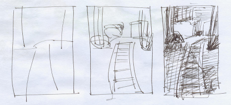
Now draw a few thumbnails each should not take you more than 10-25 seconds.
(2) Thumbnail
  • Draw 3-4 gestural lines exploring the frame.
  • Identify major forms, 3-4 maximum.
  • Identify the tones, using 2 tones and the white of the paper.

Here is an example (Let me add that step (1) is already taken care of well in these examples through the eyes and lens of Murali)


Another example..


These simple preliminary steps aid in a better picture subsequently. Next steps include how we organize the space into foreground, middle ground and background, and how we use techniques such as linear and atmospheric perspective as well as textures to define the three planes, etc.

Equipped with this simple yet effective tools, we can create more effective sketches, in an enjoyable manner.

Friday, September 14, 2012

Thumbnail Sketching

As I have recently discovered, Sketching on Location, is an exciting activity. It takes creativity and connecting with the subject to a new level. Most important aspect of sketching on location, is finding the right 'frame'.

While sketching from references, these reference images already come with frames, with a bounded rectangle. One can still do some cropping. But a lot of it is already fixed. On location, one must find the nice view, with the good balance. Typically, something interesting strikes you, and you start looking at the subject, and spontaneously begin sketching. This spontaneity is the fun of sketching.

At times, you might look for not only the subject, but the proper context too. Thumbnails are a great way to explore a scene.

As Glenn Vilppu the master, elaborates, in his classic manual, Sketching on Location, these are tools of importance. The idea is to abstract the scene, and create highly simplified views in very small size.

Here are some tools that you can make that can come handy.

A viewfinder

  1. Take the heavy backside of a used sketchbook
  2. Draw a rectangle about 2.5" by 3.5" (choose what works for you)
  3. Leave 1/2 inch on three sides, and an inch on the left side(to make it easy to hold)
  4. Cut these lines with a craft knife.
  5. Don't throw away the piece in the middle yet! You can use it to vary the ratio of the view!


A Mini Sketch book
Unless we are making a series of sketches with some sequence, it helps to focus on one picture at a time.

  1. Take a bunch of copy papers
  2. Cut each into 8 small pieces
  3. Take the heavy backside of a used sketchbook
  4. A slightly thick sheet for a cover
  5. cut these to the size of the small pieces of paper.
  6. Punch  4 to 5 holes on one side
  7. Take some spiral wire, cut it to size, and bind this into a book!


Tuesday, September 4, 2012

Sanguine

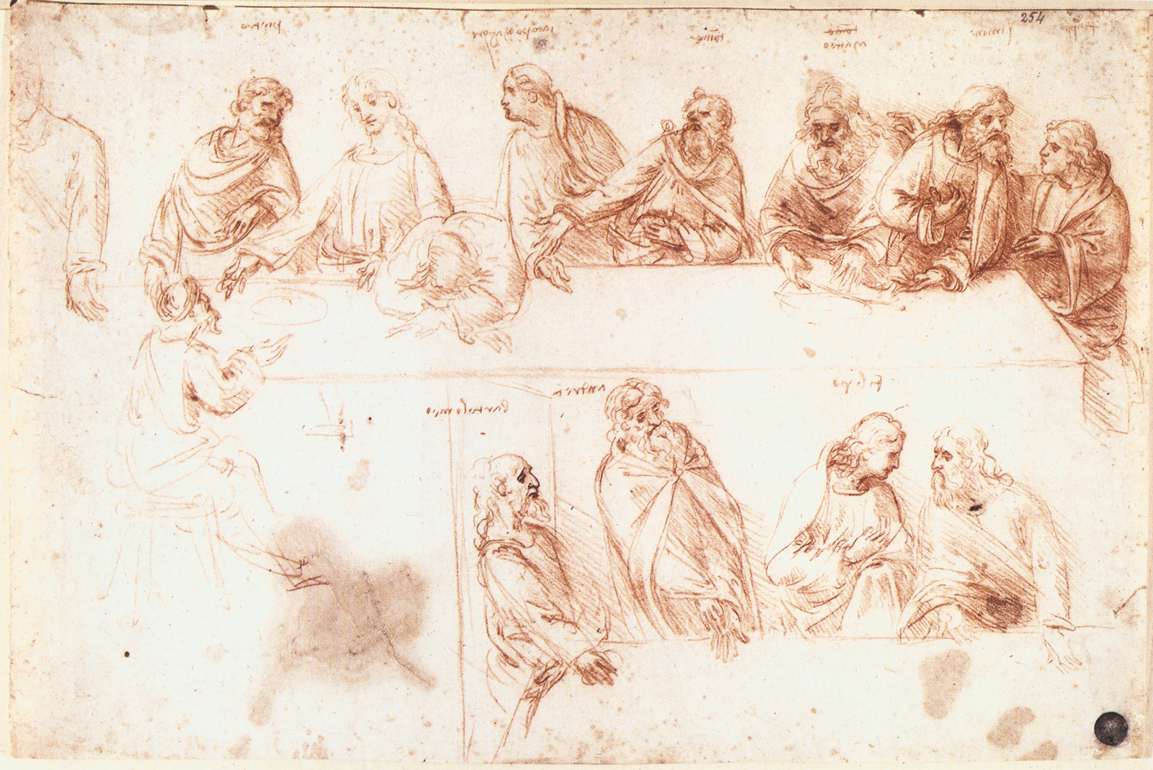
I was always intrigued by the strange combination of red color particularly reddish browns, with a dash of black and white, found in the drawings of the Masters. These were drawings, either exploratory sketches or detailed studies, for a more grand painting that would follow. But these in themselves are works of art.

Leonardo's study for The Last Supper - Sanguine

The material used was Sanguine. Its a red chalk naturally available in Italy, and the name means its the color of blood. Sometimes just the red chalk was used and sometimes along with black, to create accents, and a bit of a tonal range. 

Leonardo's Roaring Horse - Sanguine and Black

and sometimes with black and white (known as Trois Crayon technique - Three crayons!), for a still wider range to define form. 

Watteau Jeune - Sanguine, Black and White
While in a pursuit for a drawing pencil that would neither smudge like charcoal, nor be shiny like graphite, yet produce pitch black, and with a smooth traction on a nicely toothed paper, I recently discovered some amazing materials, thanks to my friends at The Sketching Forum.

All of them were available from the amazing Austrian company Cretacolor. (There is similar set of products from possibly its parent(?) Koh-I-Noor)

A beautiful black oil based carbon pencil, the Nero that comes in several hardness. I got the Soft and Extrasoft and am amazed.

A dark and light Sepia set, again oil based, which produces a rich deep brown in two tones.

And then, this amazing Sanguine! this is the pencil that I have fallen in love with. amazing consistency, and color.


One must note that these also come in dry chalk version, its a personal choice, and I prefer the oil.

To top this all, these pencils, also come as leads with a whopping 5.6 mm diameter (yes, you heard it right, its not .56 mm) !


..and.. there comes a solid metallic holder which is the magic wand. There is one particular version , the Classic, which is triangular, and has a solid grip, the whole holder is so comfortable and gives such a great feel, it changes the whole approach to drawing. The weight of the holder allows for some amazing use. 


So .... here is my drawing rig.. (1) Sanguine oil lead in the Classic holder, this is used for building forms primarily with a tonal application and (2) the Nero pencils for accentuating... and a paper with teeth! (occasionally I use the Sepias and the white). 

This setup has literally put me back on the "drawing" board. Of all the mediums and materials, this basic setup has brought drawing back into focus, and I am loving it!.

Thursday, July 5, 2012

Paper Model, Development of Surfaces and UV unwrap

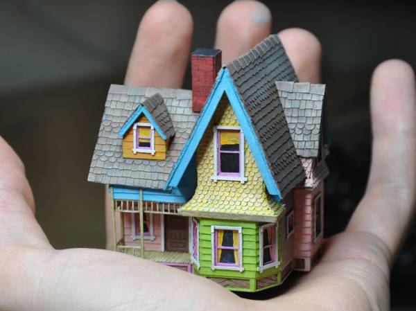
As a kid I remember my father presenting to me a small kit, which just had sheets of thick paper, with patterns printed on one side. Once I followed the printed instructions and kept folding at the places marked, I ended up with a beautiful little House. A solid 3D house out of a thin sheet of paper! I was fascinated by it. I unfolded the box house and kept looking at the patterns. Thinking about how they might have arrived at this pattern in order to get the house as the outcome.

courtesy  http://tektonten.blogspot.com


Years later when I went to do engineering, among the first things I learnt was Engineering drawing. I loved it. One of the things that we learnt there was very special to me, because it answered the question that I have had. Known as the 'Development of Surfaces', the problem was, given a solid object, we need to arrive at a two dimensional representation of it, in such a manner that one can assemble the solid object using these parts.

courtesy  http://tmsjce.com/


I simply loved this aspect. one can create a sphere, a cylinder, or quite a complex model using sheets of paper, in a very precise manner. This is the process that is used all the time for fabricating complex structures, such as a funnel in a furnace, or a fuselage of an aircraft. You come up with the patterns, and cut large pieces of metal, and then weld them  together. Actually quite simple.


Now almost two decades later, as I began learning 3D modeling for the purposes of animation, I was intrigued by a process that is known as UV unwrap.

courtesy  http://en.9jcg.com


This is part of the creation of a 3D model, particularly the surface texture. The process involves marking seams at the edges of a 3D object, and unwrapping it into a 2D surface.


Guess what...this precisely is development of surfaces. Once I figured this, I was hooked. The beauty is, once we identify the edges that should be cut, the software does the hard part of projecting these parts on paper, unwrapping it for you to apply any pattern.

Oh! The Joy of finding things out!

Thursday, June 28, 2012

Inside Studio Ghibli

Studio Ghibli is a landmark in Animation production history.


The genius of the acclaimed Japanese animator-director, Hayo Miyazaki has produced such awe inspiring films such as Spirited Away, Howl's Moving Castle and Nausicaä of the Valley of the Wind and several others in this most respected Studio.


One such movie was the hugely successful Princess Mononoke, released in 1997. One often highlighted aspect of Miyasaki is the grandeur and scale that he brings to the movies, with lavish backgrounds, with breath taking details, be it the vast green foliage, or the detailed accessories of the characters, or the personality of the individuals, each one was taken to new heights. One can feel and indulge in the art and style of Japanese water colorists and print makers, brought to life in this 20th century medium.

This master animation film maker has worked across generations of Japanese animators, his early works include the hugely successful series Heidi, Girl of the Alps. 

For those of us who badly wanted to know the life inside this genius's studio, and his working methods, there is a special treat.

The Backstage of Princess Mononoke consists of 3 documentary series directed by Toshio URATANI, who rolled a small VCR for overall of 300 hours (before editing of course!) during his 2-year reporting of Studio Ghibli and its struggles in making the phenomenal animation film Princess Mononoke.


Hope you enjoy it as much as I did.


Sunday, June 24, 2012

So you want to become an Animator : A Book List

Animation is an Art as well as a Craft. The beginner should approach it more as a Craft and focus on the skills which have to be (1) Learnt and (2) Practiced, and then look at it as an Art form.


After sifting through 100s of books on the subject, here is a distilled list.


The Bare Necessities

If you are beginning, this is all you really need for quite a long time(there can be other such sets, but this one *will work*). Resisting to get more books would well serve the purpose at this stage.
Read every single page of these books, study every single drawing of the book, re-read, copy the drawings, draw several times, workout the exercises. This will provide hundreds of hours of engaging learning, and help grow as an animator. No matter what people might say, an ability to draw is a bare necessity for an animator. And contrary to popular belief, it is not that hard to draw.

Drawing: Natural way to Draw : (Focus on Gesture, Modeled Drawing)

An Expanded Collection
*After* exhausting all that is there in the essential books, one can expand on the learning and understanding, by this set of fine books. Again, there are more, but this should be a very complete collection, for quite a long while, as an intermediate to advanced learner of animation.

Animation
Prestain Blair Cartoon Animation*
Tony White The Animator's Workbook*
Richard Williams Animators Survival Toolkit
Timing for Animation
Tezuka School of Animation Vol1 and Vol2
Eric Goldberg Character Animation

Drawing
Vilppu Drawing manual*
Natural way to Draw : Gesture, Modeled Drawing*
Walt Reed The Figure: The Classic Approach to Drawing & Construction
Jack Hamm Cartooning the Head and Figure
Vilppu Animal Drawing
Vilppu Sketching on Location
Jack Hamm Drawing Animals
Jack Hamm Landscape

Reference
Illusion of Life
Burne Hogarth
Famous Artists Course : Lessons on Human Figure & Animals
Elemental Magic Vol1 & Vol2
Facial Expression Faigin
Drawn to Life : Stanchfield

Software
Digicel Flip Book*
Blender (3D)
ToonBoom (2D)
Maya (3D)

Saturday, April 21, 2012

Ponniyin Selvan : Illustrated edition with Maniam's art

Once in a long while there occurs a rare combination of great writing and art. One such amazing creation happened in the 50s in South India.


Southern India, like most other parts of India, is known for Art, Architecture, Science and Engineering that dates back to the very beginnings of time.

Grand Anicut, 1st Century AD, among the oldest water regulatory structures in the world in use,
(the bridge is a later day construction)
image courtesy Niranjan

The splendor and glory of the art of the bygone eras are just beginning to be rediscovered after being buried in time over centuries of  Mughal and European invasion, which resulted in plundering and annihilation of both the culture and the creations of this uniquely original civilization .

The Big Temple, 10th Century AD, Among the Tallest structures in the world when built.
image courtesy Pandiyan

In the 50s, there appeared in the Magazine Kalki, a historical Novel by 'Kalki' Krishnamurthi. Ponniyin Selvan, was spun around very well researched history of the Chola dynasty, and placed in time around 1000AD. Ponni is the name of the life giving river of South India, now called Cauvery, the title of the story refers to its son, the mighty Emperor, Raja Raja Chola I.

Kalki and the First appearance of Ponniyin Selvan
image courtesy : The Hindu

The great story, with extraordinary use of the beautiful Tamil language in the most simple and elegant form, and the intriguing combination of romance, valor, trickery, conspiracy, suspense, drama , adventure and more,  made this serial story into an immortal literary treasure.


Running continuously between 1950 and 1954, it captivated  the imagination of millions of readers, taking them back in time and space.

The uniqueness of this novel was the great level of research and detail , which were presented to the readers in the form of various events , places and personalities, which can be traced back and experienced to this day.


The places that are described here forms a backbone of any historical travel around southern India, much of the great monumental structures intact for ones delight.


While such is the grandeur of the written word, what accompanied this, chapter after chapter was the masterful art of Maniam.

The man.. Maniam!
Note the absence of monitors and tablets!

Hundreds upon hundreds of illustrations, took the reader so vividly into the ancient time period. the great detail on costume, ornamentation, the settings, the compositions, the style, and the experimentation of several methods and media, makes this collection a grand reference for anyone wanting to learn illustration, not to mention the treat for any reader.


During the span of the publication of this five part serial, Maniam employed all possible techniques and mediums, A pure pen and Ink illustration, Black and white wash, Ink and brush, pen Ink and brush, Wood cut style, fresco style, gauche, watercolor.. you name it, you find it. Also he had employed very complex compositions, great action, expression, and techniques such as bleeding out of the page margins (that Scott McCloud talks about), which makes the reader feel as if one is 'inside' the story and experiencing it from within the scene!

There is a blog that is dedicated to the artist, Artist Maniam which is authored by his grand daughter, an artist, who is also the daughter of the contemporary master illustrator Maniam Selvan. 

Vikatan, the house of the favorite South Indian magazine, has come out with a fantastic edition of Ponniyin Selvan, with all the illustrations of Maniam, in a hardbound 5 volume set. What a treat!!

The Vikatan Edition
image courtesy; Vikatan Media

Having been force fed with Shakespeare, Dickens and the likes during the days at school, discovering the genius of Kalki today was a pleasant treat, and with the original illustrations of Maniam, I cannot ask for more!